CASE STUDY LANDING PAGE REDESIGN RETAIL

LOWE'S DIY.COM REDESIGN

Redesigning the landing page experience for Lowe's DIY content platform — turning a cluttered article directory into a curated, inspirational destination that converts browsers into builders.

ROLESENIOR UX DESIGNER
CLIENTLOWE'S COMPANIES
TIMELINE8 WEEKS
TOOLSFIGMA / A/B TESTING / ANALYTICS

01 — CHALLENGE

The Problem

Lowe's DIY content platform represented a significant investment in home improvement how-to content — thousands of project guides, tutorials, and articles designed to inspire and support DIY homeowners. But the landing page experience wasn't doing the content justice. A dense article grid with minimal visual hierarchy made it feel like a directory rather than a destination. Bounce rates were high, session depths were shallow, and the critical conversion metric — DIY article readers clicking through to purchase related products on Lowes.com — was significantly below target.

The platform had strong search traffic for specific project queries, but was failing at the equally important goal of inspiring people who arrived without a specific project in mind. The "discovery" experience — browsing and finding something to tackle next — was effectively nonexistent. The redesign needed to serve both the searcher and the browser while driving product conversion more effectively.

"I came to find inspiration for my bathroom and ended up leaving with a list of projects but no idea where to start. It was overwhelming."
— DIY Homeowner, Research Interview

02 — RESEARCH

The DIY Mindset

DIY home improvement exists at the intersection of aspiration and anxiety — people want to tackle projects but worry about skill level, cost, and commitment. Our research focused on understanding the motivational triggers that drove project starts, the barriers that created hesitation, and the information architecture that would best serve both specific-task and exploration-mode visitors.

Homeowner Interviews

22 participants

In-depth interviews with active DIY homeowners to understand their project discovery process, decision-making patterns, and what made them choose to tackle vs. hire out a project.

Content Analytics

3 months of data

Deep analysis of which content categories drove the most engagement, the highest scroll depth, and the best product click-through rates — identifying the content types worth featuring prominently.

Competitor Benchmarking

5 platforms

Evaluated Home Depot, Bob Vila, This Old House, Pinterest DIY, and YouTube DIY to understand emerging content discovery patterns and what made certain experiences more inspiring.

73% of visitors arrived without a specific project in mind
4.2% product click-through rate from article pages (vs. 12% target)
1.8 average pages per session on landing page visits

03 — PROCESS

Inspiration Architecture

The redesign process centered on a concept we called "inspiration architecture" — structuring the page to match the mental journey of a DIY browser, from ambient inspiration to specific project curiosity to actionable how-to content. We mapped a content hierarchy that led with aspirational project photography, moved through skill-level and room-based navigation, and resolved with project guides that embedded product recommendations naturally rather than forcing a hard transition to the shopping context.

RESEARCH
IA DESIGN
DESIGN
A/B TEST
LAUNCH
CONTENT IA INSPIRATION ARCHITECTURE WIREFRAMES
HIGH FIDELITY DIY.COM REDESIGN PROTOTYPE

04 — SOLUTION

From Directory to Destination

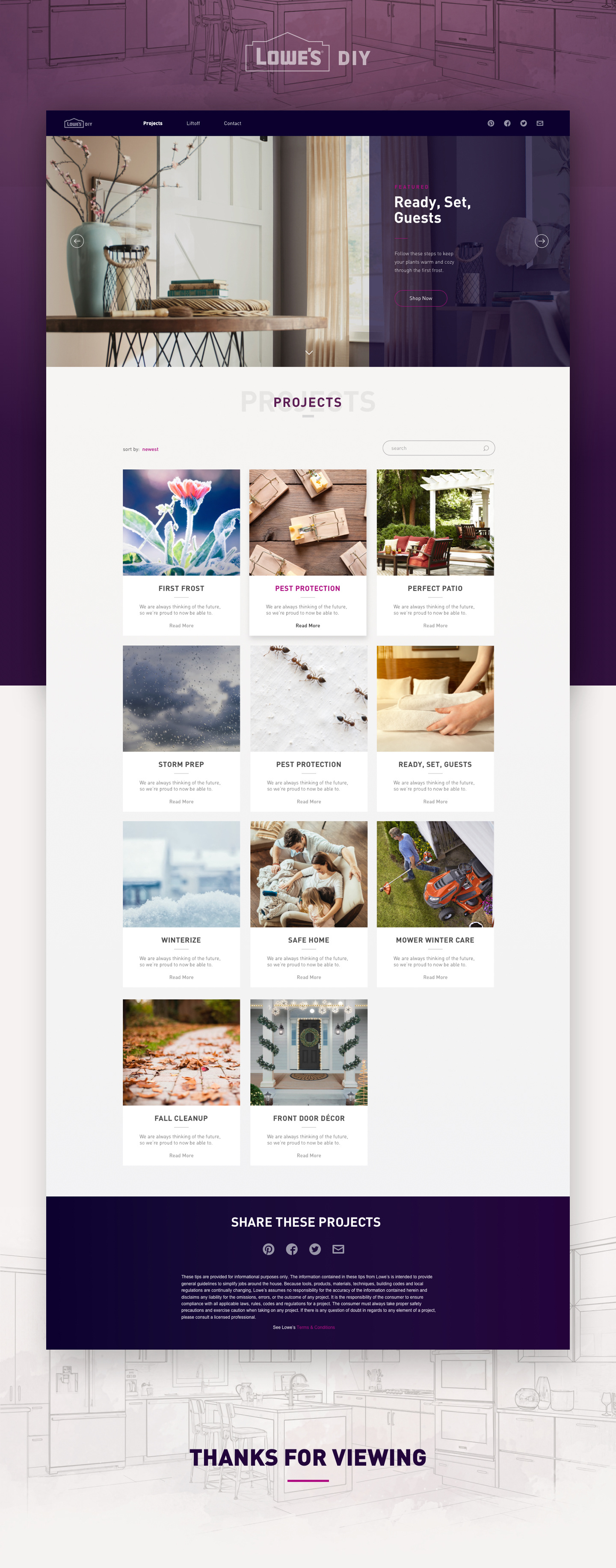
The redesigned landing page leads with a seasonally curated hero that showcases high-impact projects with photography that signals achievability rather than intimidation. Below the hero, a "start here" section organizes entry points by skill level (Beginner, Confident, Advanced) and by space (Kitchen, Bathroom, Outdoors) — giving both the browser and the searcher a fast path to relevant content. Featured project cards were redesigned to prominently surface skill level, time commitment, and estimated cost before a visitor clicks in — pre-filtering out projects that don't match their reality.

Product integration was rebuilt as contextual "what you'll need" modules embedded within articles rather than banner-style calls to action. By appearing at the moment of relevance in the project context, product recommendations drove dramatically higher engagement.

FINAL DESIGN

Lowe's DIY.com Redesign — final design

EXPERIENCE DEMO

01

SKILL-LEVEL NAVIGATION

Entry-point navigation organized by skill level and space type — giving browsers a fast path to relevant projects without overwhelming them with the full content catalog from the first scroll.

02

PROJECT REALITY CHECK

Skill level, time estimate, and cost range surfaced on project cards before click — pre-filtering projects to match what visitors can actually take on, reducing bounce from mismatched expectations.

03

CONTEXTUAL PRODUCT INTEGRATION

Product recommendations embedded as "what you'll need" modules within article content — appearing at the moment of maximum relevance rather than as interruptive banners competing with the how-to content.

05 — RESULTS

The Impact

A/B testing of the redesigned landing page showed significant improvements across all key metrics within the first four weeks. Session depth improved substantially, indicating that visitors were exploring more content per visit. The product click-through rate from article pages nearly tripled compared to the control, driven primarily by the contextual "what you'll need" module placement. The redesign was rolled out as the new baseline for the platform.

+112% Product Click-Through
+64% Pages Per Session
-31% Bounce Rate
+48% Return Visit Rate

06 — LEARNINGS

What I Learned

01

ASPIRATION AND ACCESSIBILITY MUST COEXIST

The best DIY content experience inspires people to attempt things they might otherwise hire out — but only if it also makes those things feel genuinely achievable. Photography that shows beautiful results but doesn't acknowledge the work communicates aspiration without accessibility. The two have to be balanced deliberately.

02

CONTENT COMMERCE IS DIFFERENT FROM E-COMMERCE

Product recommendations don't work in content contexts the same way they work in shopping contexts. The moment of relevance is different, the user mindset is different, and the placement logic has to reflect that. Treating article pages like product pages was the root cause of the low click-through rates in the original design.

03

INFORMATION SCENT DRIVES DISCOVERY

Adding skill level, time, and cost metadata to project cards increased click rates significantly — not because users needed more information, but because it gave them the "information scent" to know whether the click was worth it. Navigation confidence is as important as navigation ease.

NEXT PROJECT

LOWE'S SMART HOME →