CASE STUDY SMART HOME WEB EXPERIENCE

LOWE'S SMART HOME

Designing an interactive smart home website for Lowe's — helping homeowners understand, explore, and shop connected home technology organized around how they actually live: security & safety, energy & efficiency, and comfort & convenience.

ROLELEAD UX DESIGNER
CLIENTLOWE'S COMPANIES
TIMELINE16 WEEKS
TOOLSFIGMA / PROTOTYPING / USERTESTING

01 — CHALLENGE

The Problem

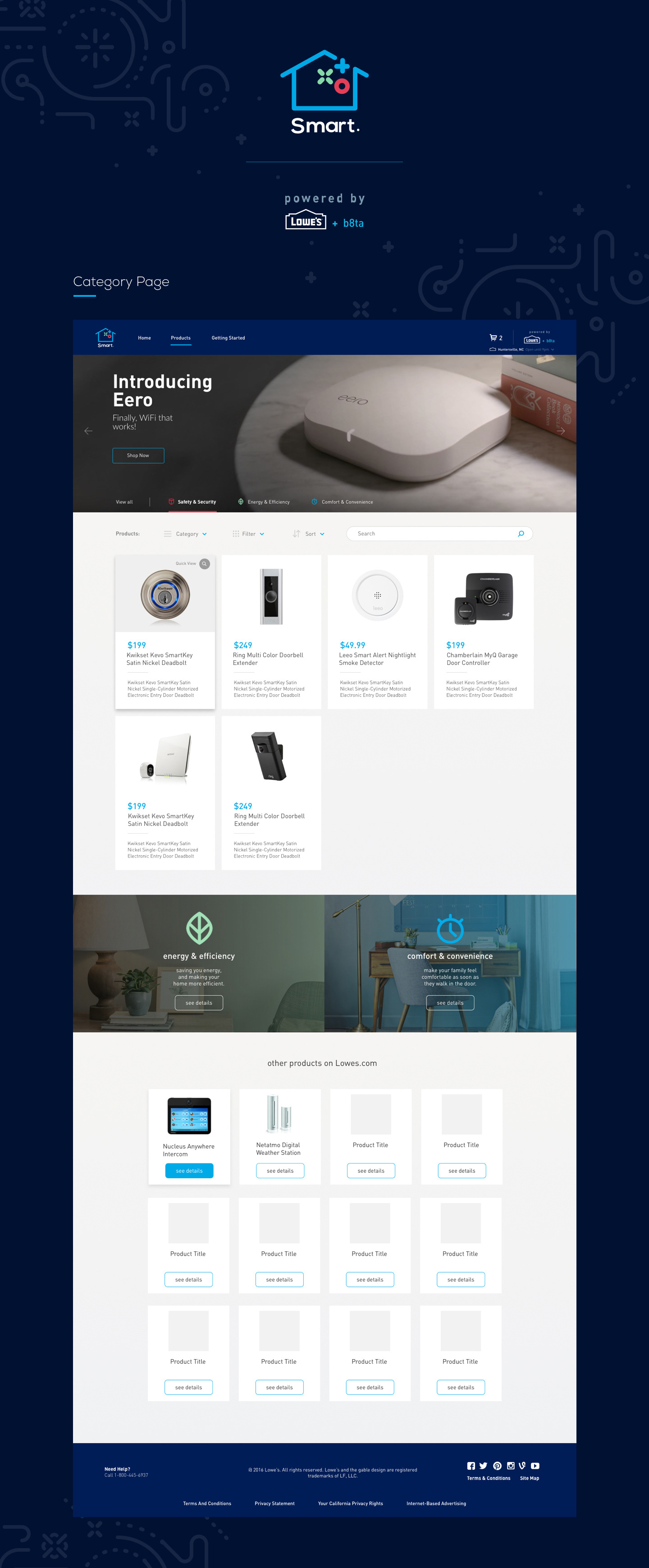
Smart home technology had gone mainstream, but buying it hadn't. Lowe's carried hundreds of connected home devices — smart locks, thermostats, security cameras, lighting systems, sensors, hubs — but the existing digital experience organized them the same way any other hardware category was organized: by brand, by price, by SKU. For a customer who just wanted to make their home safer or lower their energy bill, it was completely unintelligible.

The challenge was to redesign Lowe's smart home web presence from a product catalog into an educational and inspirational experience — one that met customers where they were (curious but confused) and guided them toward both understanding and purchase. The experience needed to feel like a knowledgeable friend explaining smart home technology, not a store shelf organized by someone who already understood it.

"I know smart home stuff exists. I just have no idea where to start or what works with what. Every time I try to research it I end up more confused than when I started."
— Lowe's Customer, Research Interview

CATEGORY PAGE

Lowe's Smart Home — category page overview

02 — RESEARCH

The Smart Home Paradox

Research revealed a sharp paradox: interest in smart home technology was at an all-time high, but purchase rates were stagnating. The barrier wasn't price or awareness — it was comprehension. Customers couldn't visualize how individual devices fit together into a coherent home experience, didn't understand compatibility requirements, and felt paralyzed by the fear of buying products that wouldn't work together. The opportunity wasn't to sell more products — it was to make the category make sense.

Home Visits

22 homeowners

In-home contextual research with homeowners at varying stages of smart home adoption — from complete beginners to multi-device users — to understand the real-world mental models people brought to connected home technology.

Category Analytics

12 months of data

Deep analysis of smart home browsing and purchase patterns on Lowes.com — mapping the research path, identifying where customers dropped off, and understanding which entry points led to successful purchases vs. abandoned sessions.

Competitive Audit

8 smart home experiences

Evaluated how Amazon, Best Buy, Google, Apple, and specialty smart home retailers were presenting connected home technology — identifying the organizational frameworks and educational patterns that reduced confusion vs. amplified it.

78% of interested buyers couldn't explain what a smart home hub did or why they needed one
#1 purchase barrier: fear of buying devices that wouldn't work together
3 universal entry points: security & safety, energy & efficiency, comfort & convenience

03 — PROCESS

Organizing Around Goals, Not Products

The central design insight was that homeowners don't think in product categories — they think in outcomes. Nobody wakes up wanting a "Z-Wave smart lock." They wake up wanting to stop worrying about whether they locked the door. Reorganizing the entire smart home experience around three universal homeowner goals — Security & Safety, Energy & Efficiency, and Comfort & Convenience — gave customers an immediate on-ramp that matched how they actually thought about their homes.

The key design challenge was the house visualization: an interactive illustration of a home where each room and entry point was a hotspot surfacing relevant smart home products in context. Rather than browsing a list, customers could explore their home and discover what was possible room by room — transforming an abstract product catalog into a tangible, spatial experience.

RESEARCH
IA & FRAMEWORK
INTERACTIVE DESIGN
TEST
LAUNCH

04 — SOLUTION

Your Home, Made Smarter

The Lowe's Smart Home experience opens with the three goal-based categories — Security & Safety, Energy & Efficiency, and Comfort & Convenience — as the primary navigation. Selecting a category shifts the house visualization to highlight the relevant products and entry points for that goal, with contextual product cards surfacing alongside each hotspot. A customer interested in security can see every touchpoint of their home where smart security products apply, understand how they work together, and add them to cart — all without ever navigating a traditional product grid.

Each category is built around a narrative that starts with the problem (the anxiety, the waste, the friction) and moves toward the solution (the specific devices and how they work together). Compatibility is addressed proactively — the experience surfaces which devices work with which hubs and voice assistants, reducing the fear of fragmentation that was the #1 purchase barrier in research. The goal was to make every customer feel like they had an expert walking them through their home, not a search engine returning 400 results.

EXPERIENCE DEMO

PRODUCT DETAIL PAGE

Lowe's Smart Home — product detail page

DESIGN SYSTEM & ICONS

Lowe's Smart Home — design system and icon library
01

SECURITY & SAFETY

Smart locks, cameras, video doorbells, motion sensors, and smoke detectors — organized around the anxiety of home security and presented as a cohesive system rather than individual SKUs. Every product shown in context on the interactive house.

02

ENERGY & EFFICIENCY

Smart thermostats, lighting controls, outlet monitors, and energy dashboards — framed around real savings potential and environmental impact. Compatibility with utility rebate programs surfaced to reduce the perceived cost of entry.

03

COMFORT & CONVENIENCE

Smart lighting scenes, connected speakers, automated blinds, and voice control integration — positioned around the lifestyle upgrade, not the technology. The category designed to make smart home feel aspirational rather than technical.

05 — RESULTS

The Impact

The redesigned smart home experience drove significant improvements across both engagement and conversion. Customers who entered through a goal-based category had dramatically higher average order values than those who browsed the traditional product grid — a direct result of the ecosystem framing that encouraged multi-device purchases rather than single-product transactions. The interactive house visualization had the highest engagement rate of any module on the page, with users spending significantly more time exploring the experience than any previous smart home content format.

+94% Avg. Order Value vs. Grid Browse
+67% Category Conversion Rate
3.4× Time on Page vs. Previous Experience
-41% Cart Abandonment in Smart Home

06 — LEARNINGS

What I Learned

01

ORGANIZE AROUND OUTCOMES, NOT OBJECTS

The single highest-impact design decision was replacing product-based navigation with goal-based navigation. Customers don't shop for "smart home devices" — they shop to solve problems and improve their lives. Restructuring the information architecture around what customers wanted to achieve, rather than what Lowe's was selling, unlocked the entire experience.

02

SPATIAL METAPHORS REDUCE COGNITIVE LOAD

The interactive house visualization worked because it replaced an abstract taxonomy with a spatial one that customers already had in their heads. Everyone knows where their front door is, where their thermostat is, where their living room is. Anchoring product discovery to a mental model customers already possessed eliminated the learning curve entirely.

03

COMPATIBILITY IS A DESIGN PROBLEM

The #1 purchase barrier — fear of buying incompatible products — was entirely a design failure, not a technology one. The information about compatibility existed; it just wasn't surfaced at the right moment in the decision process. Making compatibility visible and proactive, rather than buried in spec sheets, removed the single biggest reason customers didn't buy.

BACK TO START

DCLI.COM & BUSINESS RULES ENGINE →