CASE STUDY WEB REDESIGN AI ASSISTANT

DCLI.COM REDESIGN

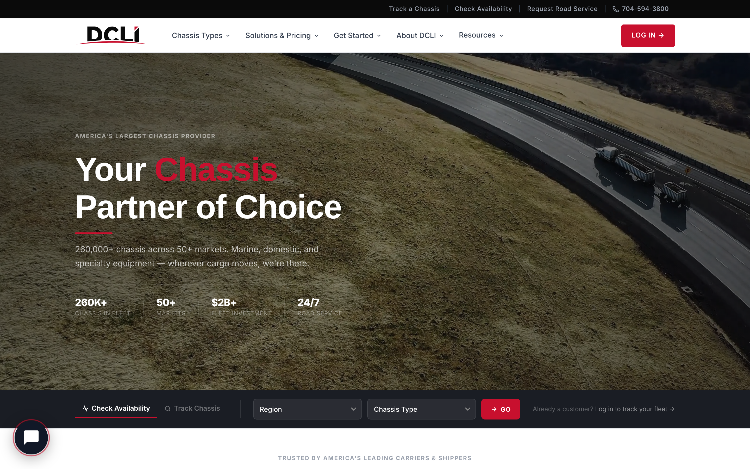
A redesign of DCLI's website that helps carriers, shippers, and ocean lines find the right chassis program quickly, with Chassie, an AI assistant, on every page.

OPEN THE LIVE DESIGN ↗
ROLEUX/UI DESIGNER
CLIENTDCLI
TIMELINE2026
TOOLSCLAUDE DESIGN / HTML / CSS / JS

01 — THE BRIEF

A website that matches the business

DCLI moves chassis for ocean carriers, trucking companies, cargo owners, and rail intermodal operations. The old site was built on DCLI's internal design system and didn't do enough to help visitors work out which chassis program fit their operation.

The redesign set out to answer three questions quickly: what DCLI offers, which program fits my operation, and how to get started. Navigation and content are organized by audience, so a motor carrier, an ocean line, or a shipper each sees a path that is theirs.

02 — DESIGN CONCEPT

Industrial, clear, and modern

The design concept was built around three principles. The site should feel like the infrastructure it describes: precise, dependable, and built to last.

01

INDUSTRIAL AUTHORITY

Bold, compressed headings and structured layouts. The visual weight communicates scale.

02

OPERATIONAL CLARITY

Every section answers a specific question a buyer or operator would ask. Red accent lines and section labels guide the eye.

03

RESTRAINED MODERNITY

Light backgrounds, subtle borders, and a limited palette. Motion is brief and purposeful: scroll reveals and panel slides, never decoration.

DCLI Red#C8102E · primary action
Red Dark#9B0B22 · hover
DCLI Teal#007272 · product accent
Near Black#0A0A0A · nav and dark areas
Gray 700#374151 · body text
Gray 100#F3F4F6 · card background

Two typefaces carry the system: Assistant for headings and display figures, and Inter for body copy and interface text. Buttons are deliberately square-cornered (4px) to keep the tone structured.

03 — THE SITE

Click through the pages

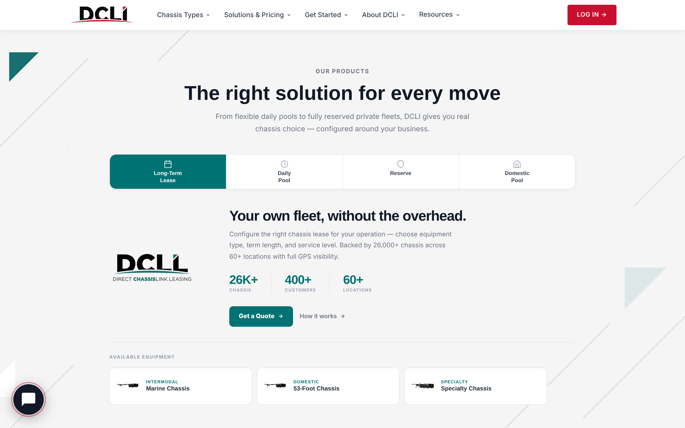
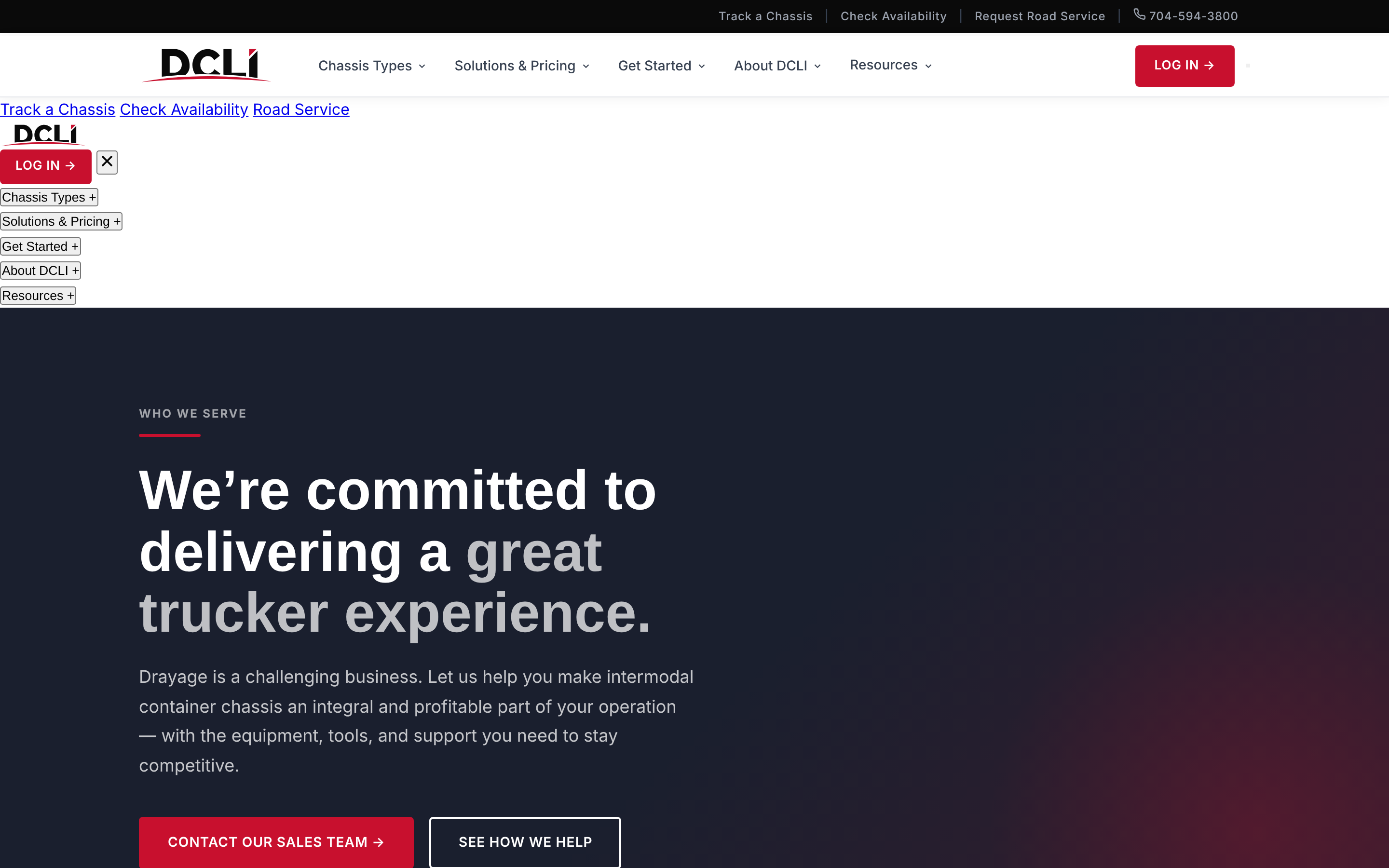
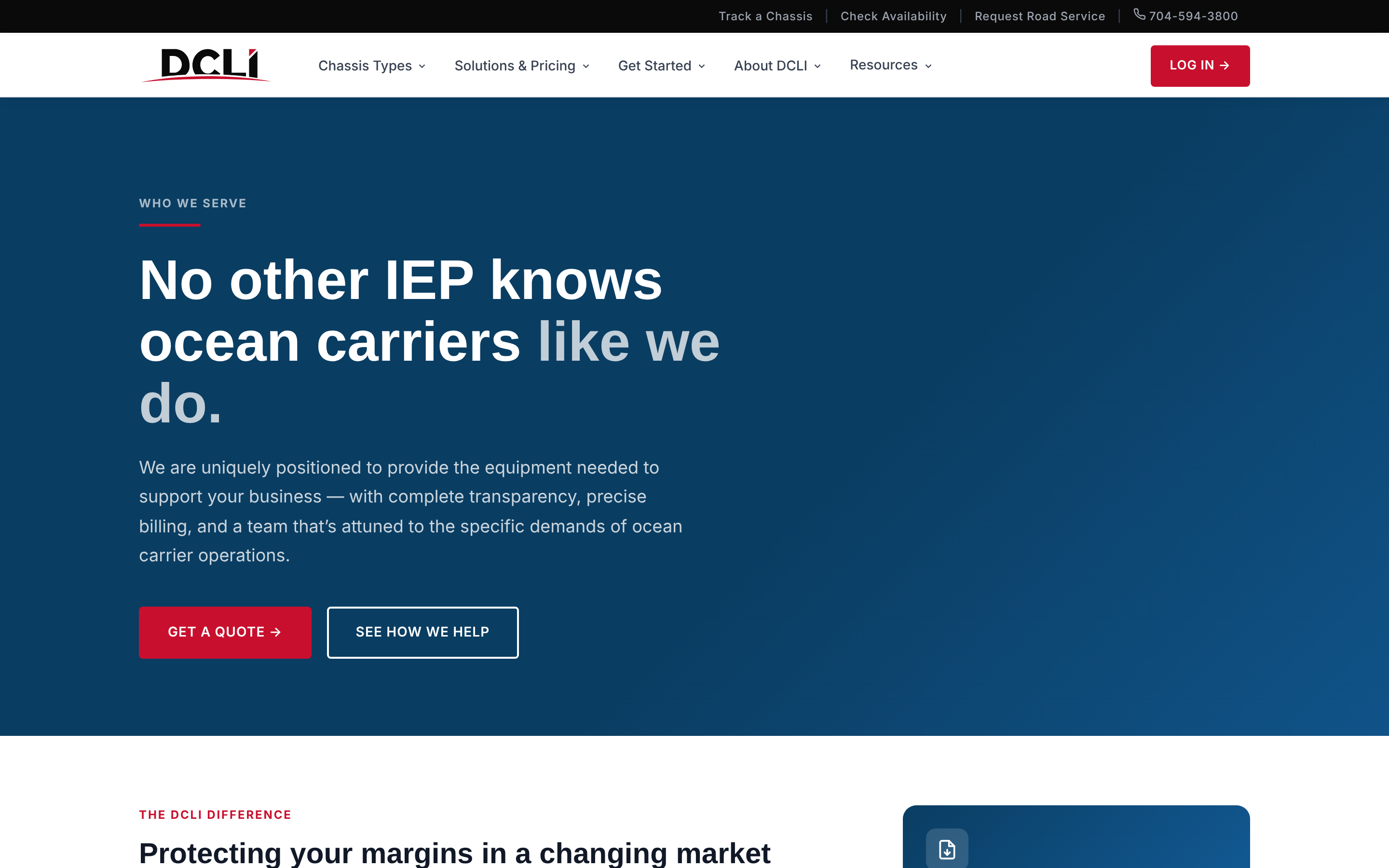
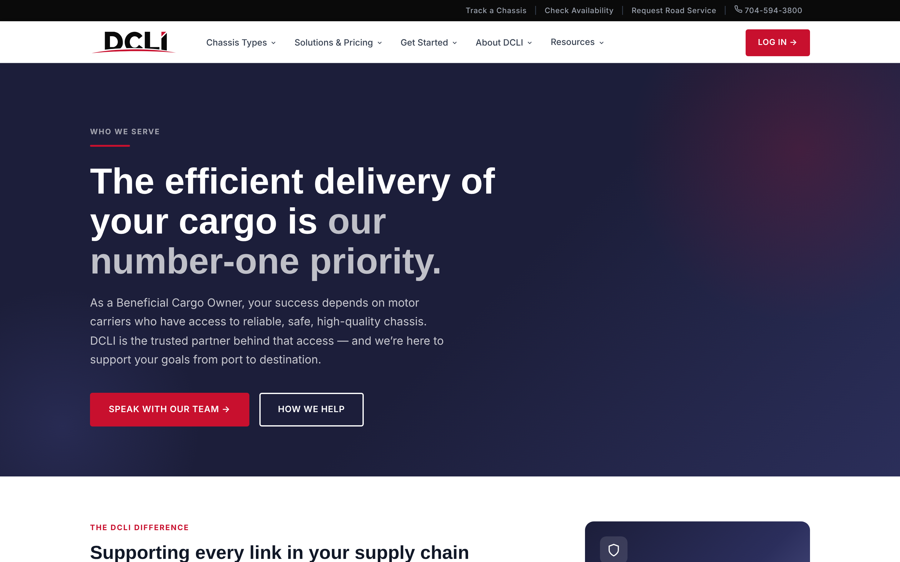
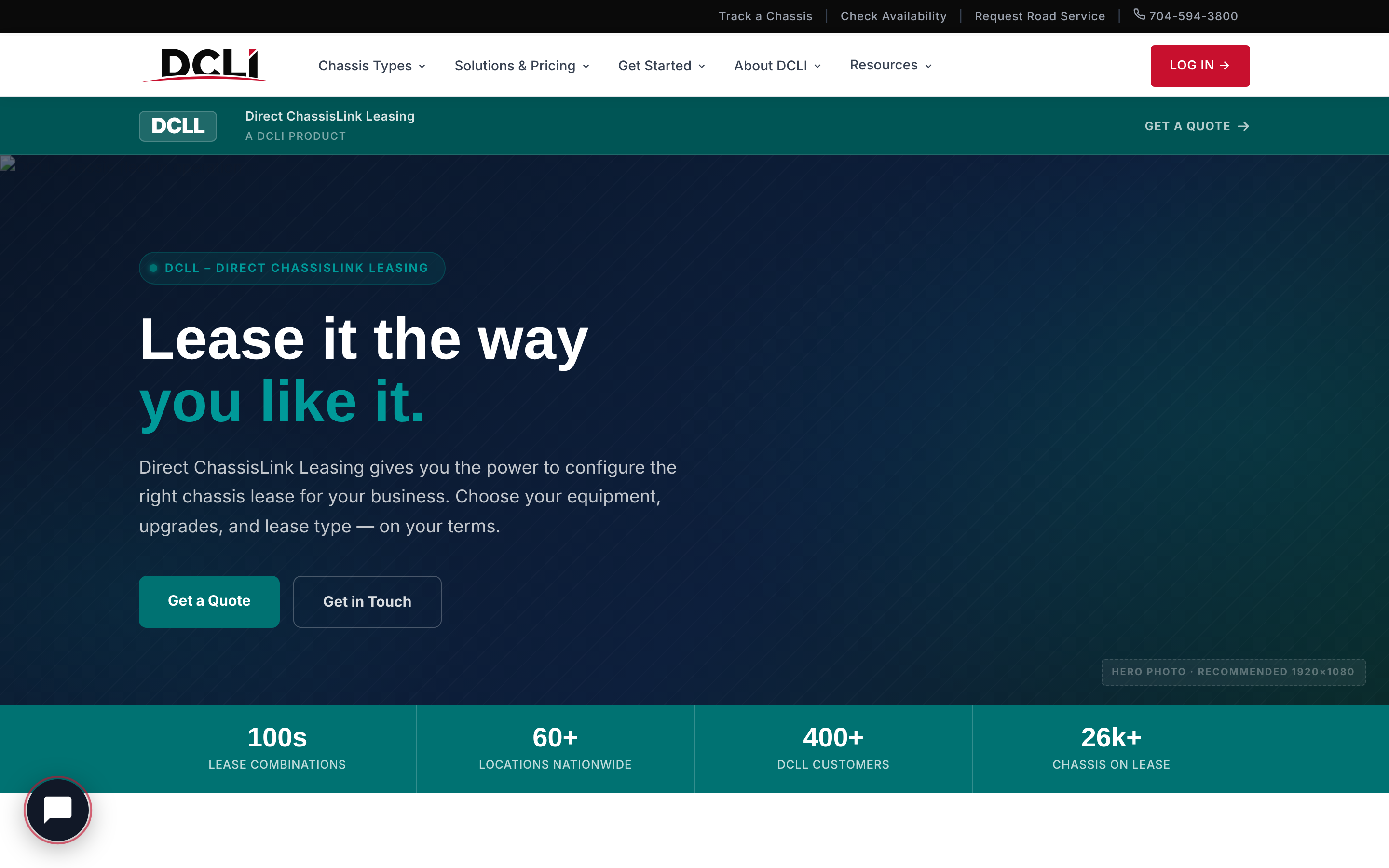
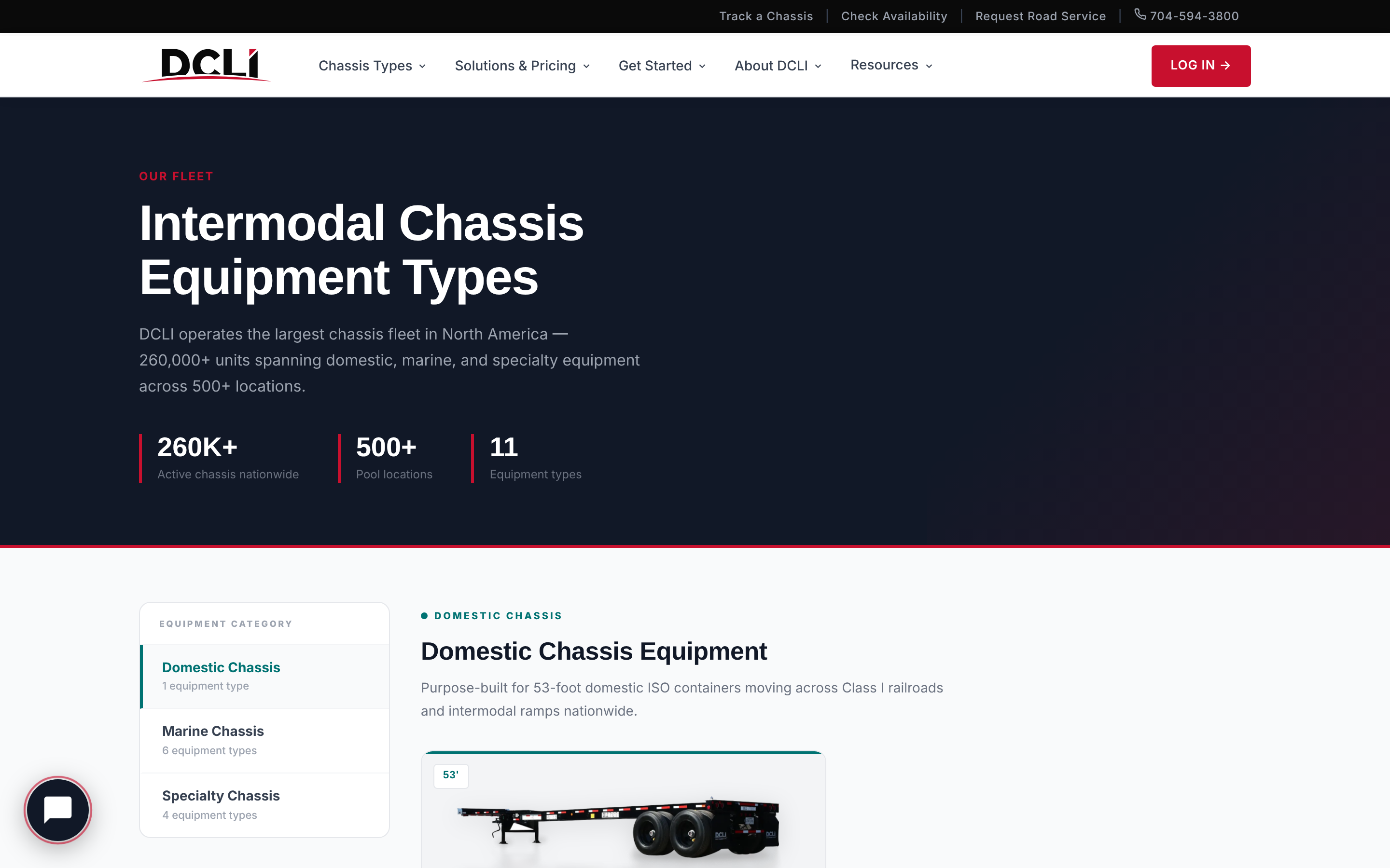
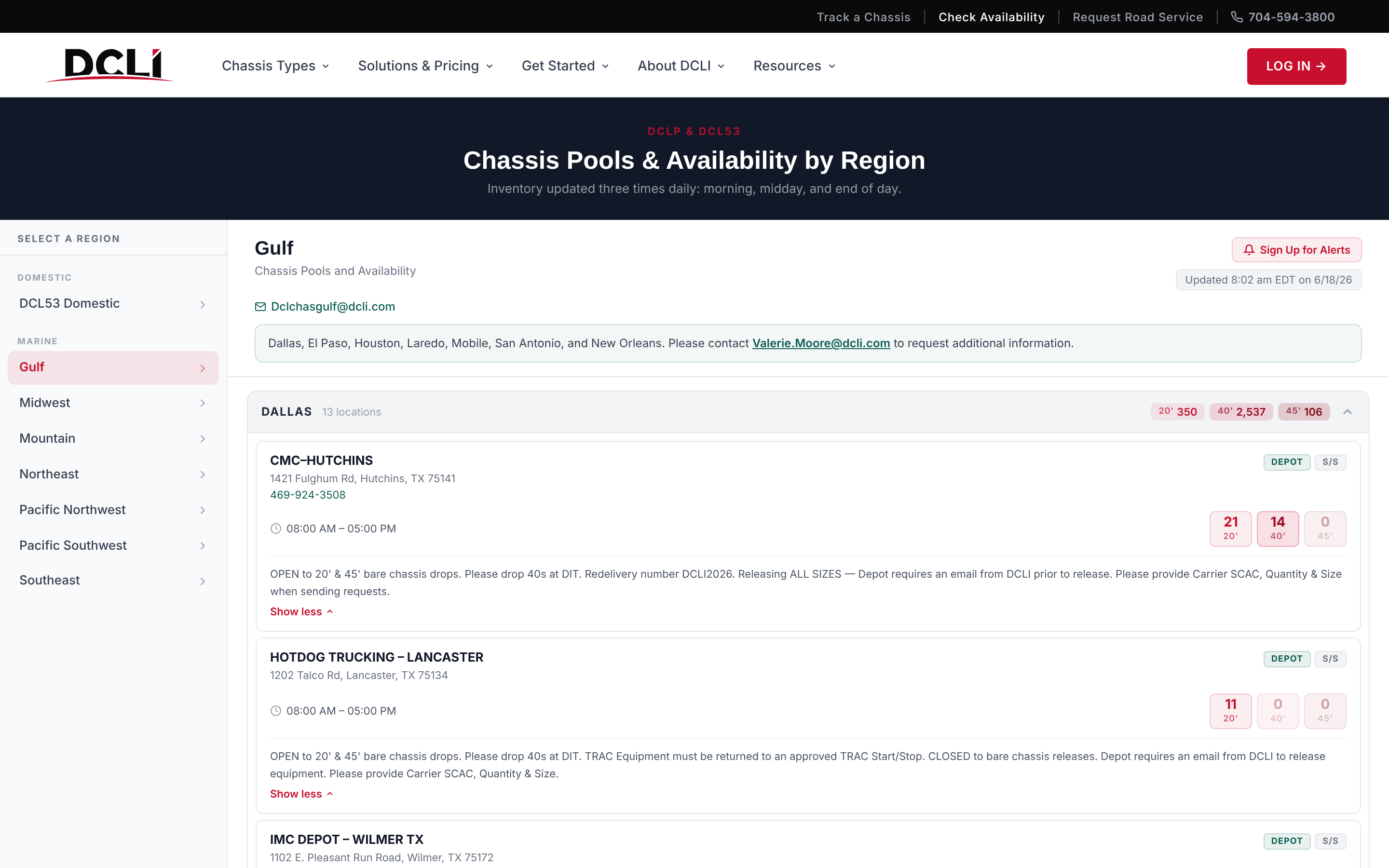
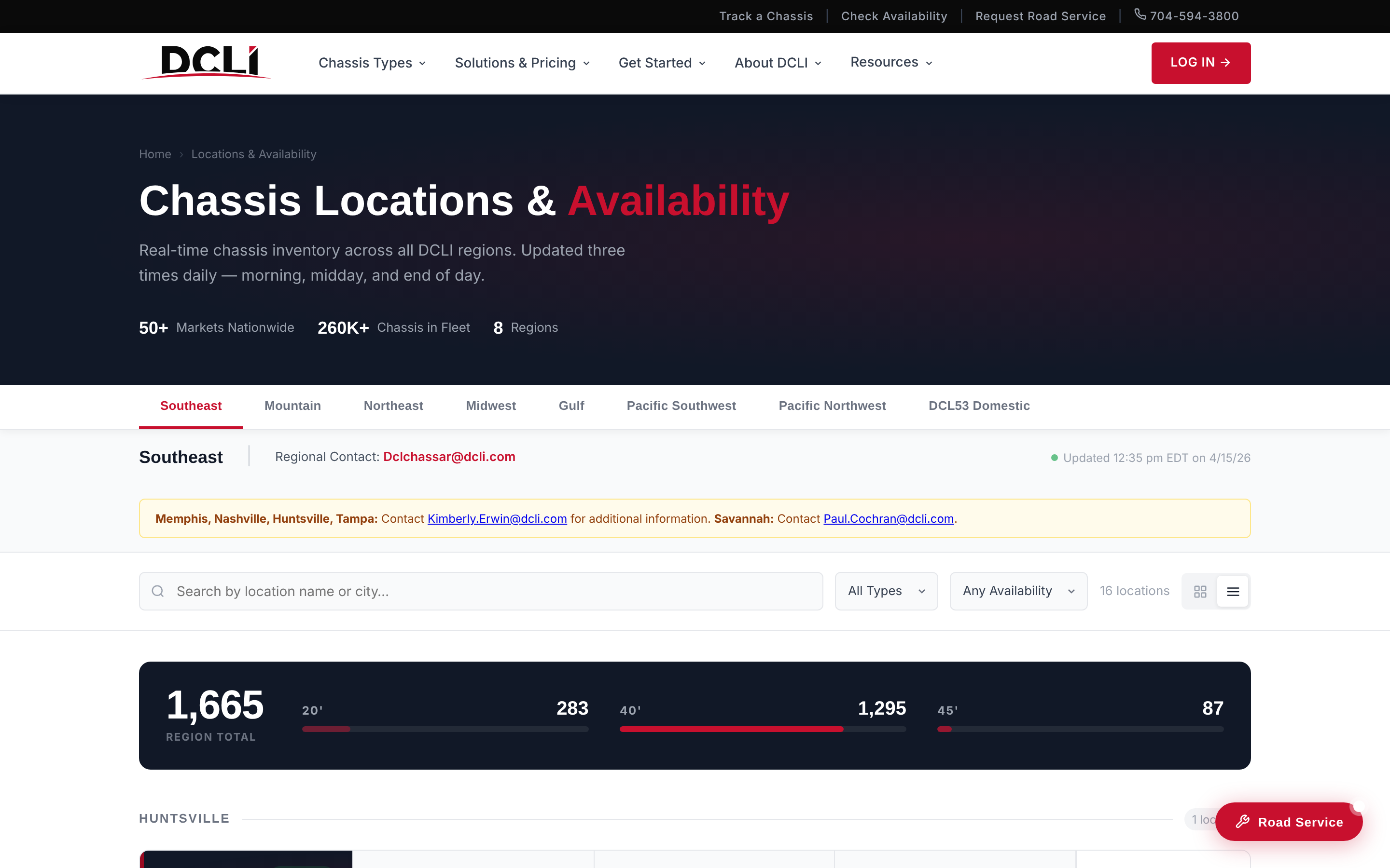
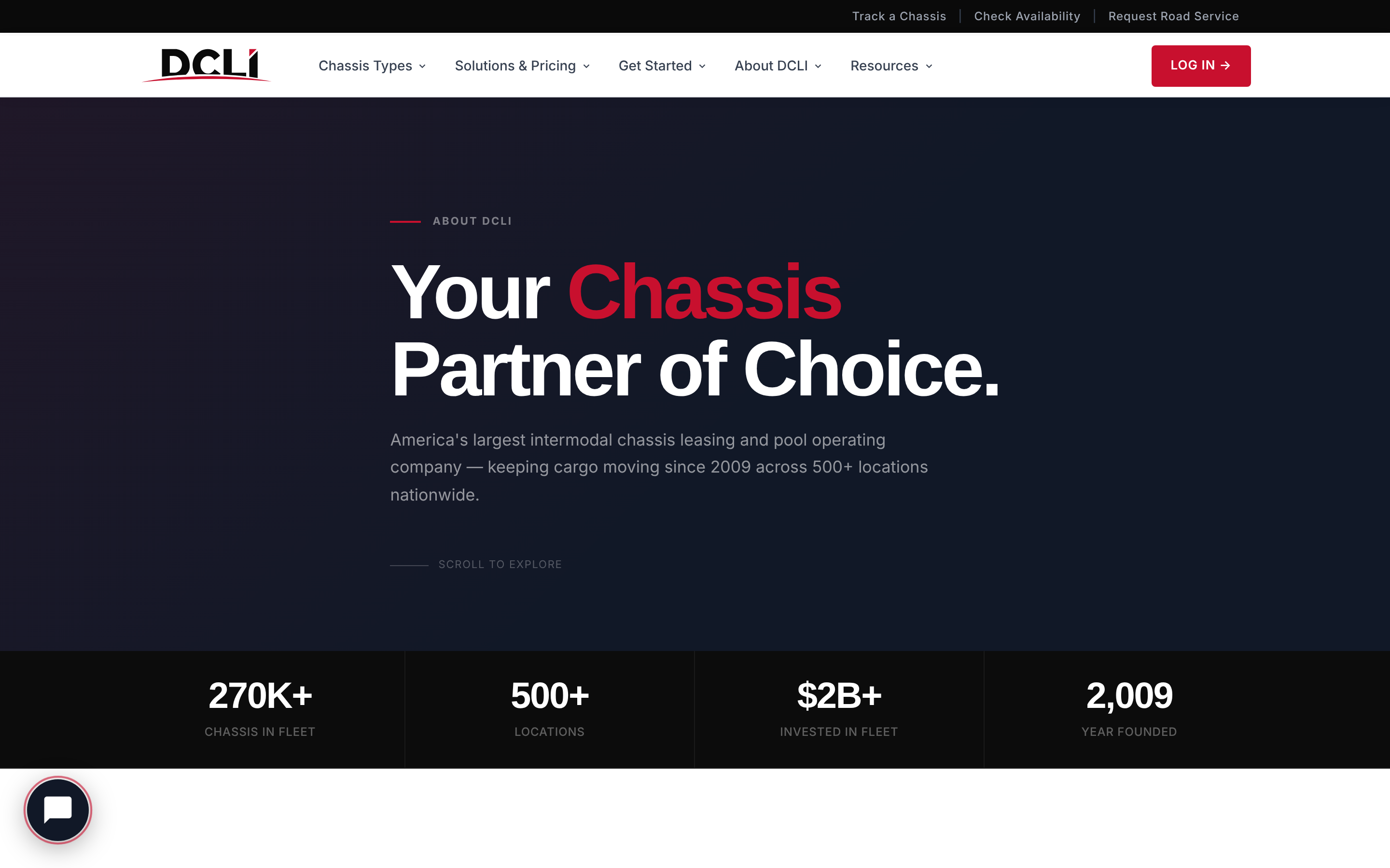
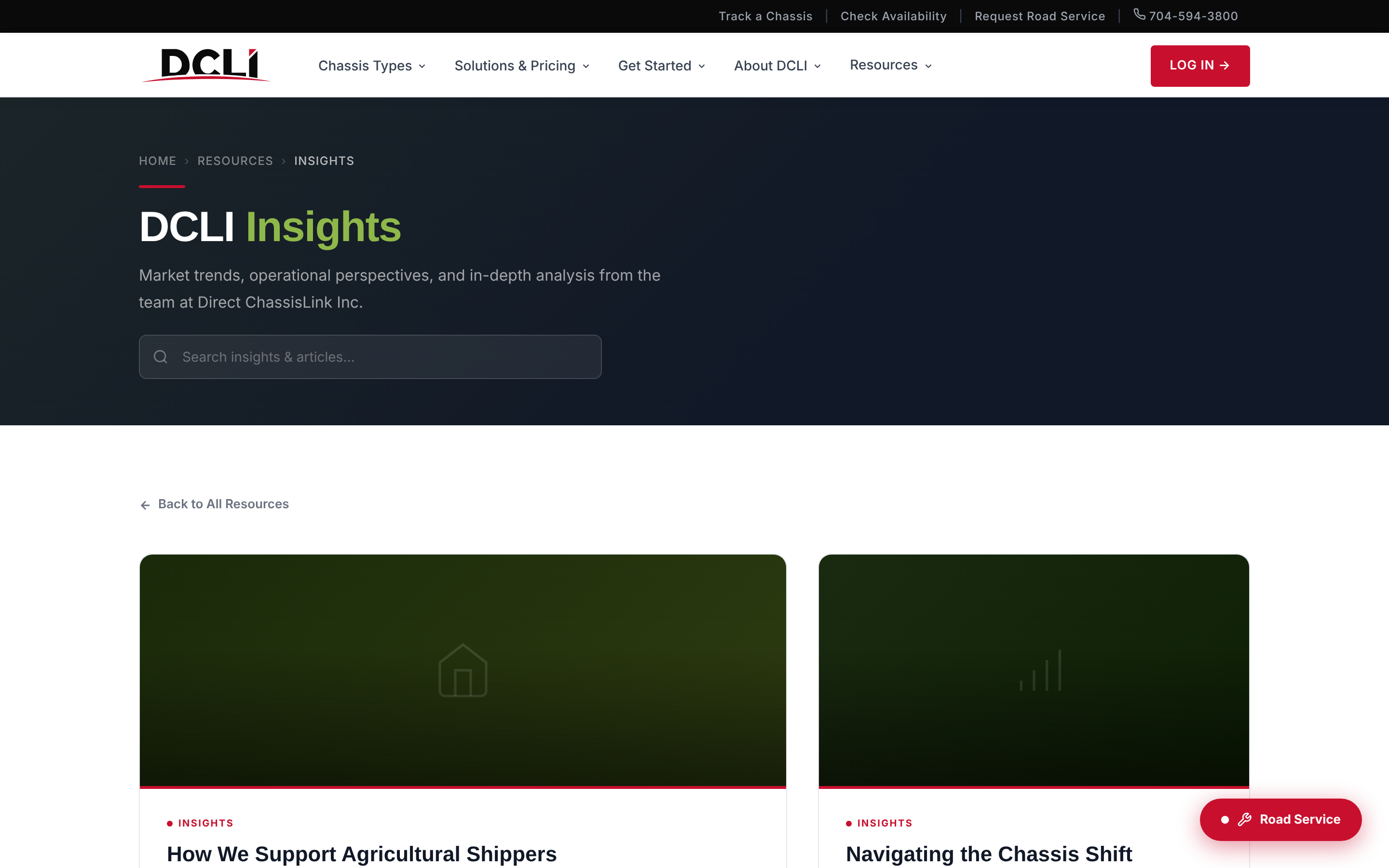
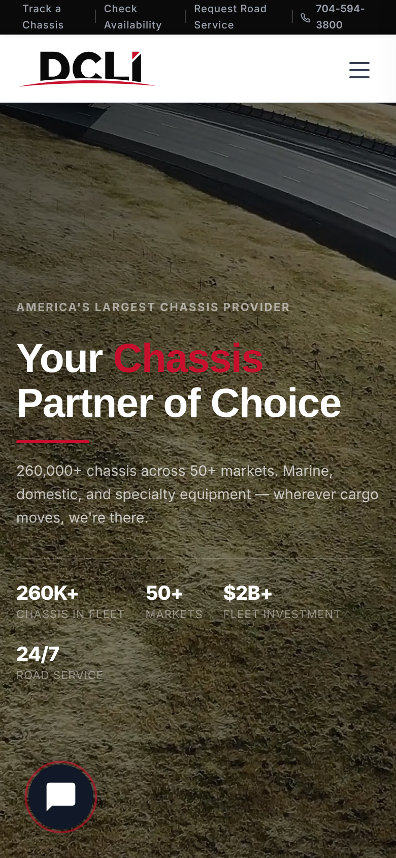
The homepage leads with a chassis search, then splits the audience into motor carriers, ocean carriers, shippers, and rail intermodal. Each product page follows the same pattern: what it is, who it's for, and how to get started.

The homepage hero, looping
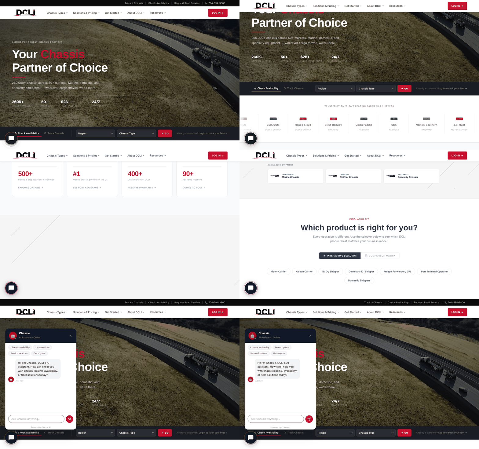
Walkthrough of the DCLI homepage, scrolling through the sections and opening Chassie

Walkthrough: scrolling the homepage, then opening Chassie
04 — CHASSIE

An assistant on every page

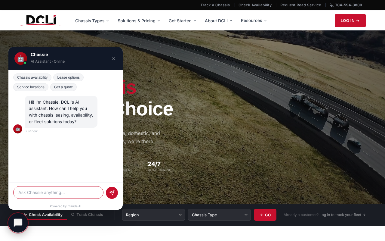
Chassie is an AI assistant built into the site. Visitors can ask about chassis availability, lease options, service locations, or a quote, with quick starter questions above the input. It's powered by Claude and is available from a floating button on every page.

01

QUICK STARTS

Starter chips for the most common questions, so a first-time visitor doesn't have to know the product codes.

02

ALWAYS ONE CLICK AWAY

A floating launcher stays on every page, so help is available without leaving the content.

03

A HUMAN FALLBACK

Phone, quote, and sales links remain on the page, so anyone who needs a person can reach one.

05 — TESTING

Simulated user tests

Before launch, I ran the site through simulated user tests. Each test used AI-generated personas (motor carriers, ocean carriers, new shippers, and existing customers) to walk through the pages and grade clarity, navigation, and conversion paths. These are not real participants, so the results point to likely problems rather than proving how real customers behave.

8Personas tested
28Sections scored
16Recommendations
B+Homepage grade
The top fixes from the report were technical rather than visual: stat counters that displayed zero, primary sign-up buttons that didn't link anywhere, placeholder image labels left on a product page, and a utility bar that only worked on the homepage.

06 — STATUS

Where it stands

The redesigned site is built and in review. The next step is resolving the priority fixes from testing and confirming the content with DCLI before launch.

NEXT PROJECT

MANIFEST DESIGN SYSTEM →